A useful birthday website does not need dozens of sections. It needs a clear welcome, a personal message, a few meaningful details and a layout that is easy to open on a phone. Use this checklist to decide what belongs on the page—and what can be left out.
Quick answer
A useful birthday website does not need dozens of sections. It needs a clear welcome, a personal message, a few meaningful details and a layout that is easy to open on a phone. Use this checklist to decide what belongs on the page—and what can be left out.
- A clear welcome and recipient name
- A heartfelt birthday message
- A small photo gallery or memory timeline
The essential sections
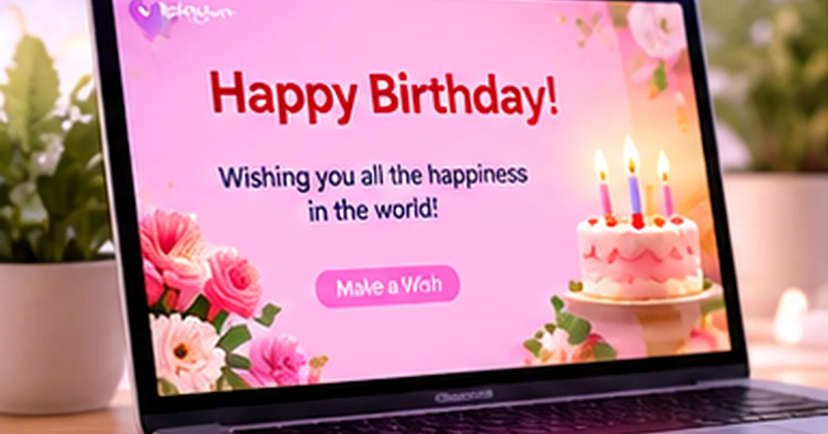
Begin with a welcome that identifies the person being celebrated. Add a short birthday message near the top so the purpose is clear immediately. A photo or illustration can establish the mood, but the text should remain readable and should not be hidden behind decoration.
Next, include a small collection of memories. A gallery can show different moments, while a timeline can explain how those moments connect. Choose images that have a story and captions that provide context. A large number of photographs is not automatically more meaningful.
- A clear welcome and recipient name
- A heartfelt birthday message
- A small photo gallery or memory timeline
- A closing wish or sign-off
Optional elements that can make the page feel personal
Depending on the selected template, you may be able to include music, a countdown, a hidden note, a video greeting, an interactive reveal or a short list of reasons you appreciate the person. Pick one or two. Too many effects compete with the message and can make the page slower or harder to navigate.
Music should be optional and should not carry essential information. Some browsers block autoplay, and some recipients may be in a quiet place. If a video is included, give it a descriptive title and provide a text summary so the meaning is clear even when the video does not play.
- One optional reveal or interaction
- Music or video only when relevant and supported
- Short captions or a list of personal appreciations
A checklist for photos, text and accessibility
Use images you have permission to share. Check that faces are not cropped awkwardly and that photographs look clear on a small screen. Add descriptive alt text for meaningful images; decorative images can use empty alt text when implemented appropriately. Use readable contrast, clear buttons and headings that describe each section.
Read the message out loud once. Correct names, dates and spelling, and remove anything that could embarrass the recipient if someone else sees the link. If the page is shared privately by link, remember that a forwarded link may reach a wider audience.
- Confirm image permission and mobile cropping
- Use descriptive image text where it adds meaning
- Check contrast, font size and button labels
- Remove sensitive information before publishing
Put the information in the right order
The first screen should answer three questions: who is this for, why am I seeing it and what can I do next? After that, allow the page to unfold. Put a longer story or gallery below the introduction, then finish with a clear closing wish. If the template includes multiple sections, use them to organise the content rather than filling every space.
Here is a practical order: welcome, message, photos, memory captions, optional surprise, final wish. For a family or group page, add a section for contributions only if the selected platform supports it and you have a plan to review submissions.
- Keep the first screen focused
- Place the most important message early
- Use later sections for memories and extras
What to leave off a birthday website
Avoid long blocks of copied quotes, unrelated photographs, tiny text, flashing effects and background audio that cannot be paused. Do not add private addresses, account details, personal phone numbers or information the recipient would not want shared. If an element requires a click, make it clear what will happen next.
Before publishing, preview the entire page on mobile and desktop, test every button and open the published URL in a private browser window. The final page—not the builder preview—is what the recipient will see.
- No private details that do not need to be public
- No autoplay audio as the only way to understand the page
- No untested buttons or placeholder text
Frequently asked questions
What is the most important part of a birthday website?
The personal message is usually the heart of the page. A clear welcome and a few meaningful details help the recipient understand why the page was made for them.
Should a birthday website have music?
Only if it adds something to the experience and the template supports it. Keep the page understandable without sound and give visitors control over playback.
Should I add a countdown to a birthday website?
A countdown can build anticipation when the timing is correct, but it is optional. Confirm the recipient’s time zone and avoid making the page confusing after the countdown ends.
How do I make a birthday website mobile-friendly?
Use a responsive design, readable text, appropriately sized images and obvious controls. Preview the final published page on a real phone before sharing it.
Explore more thoughtful ideas
Browse the Wishly Guide library, explore all topics or visit the main Wishly website ↗.